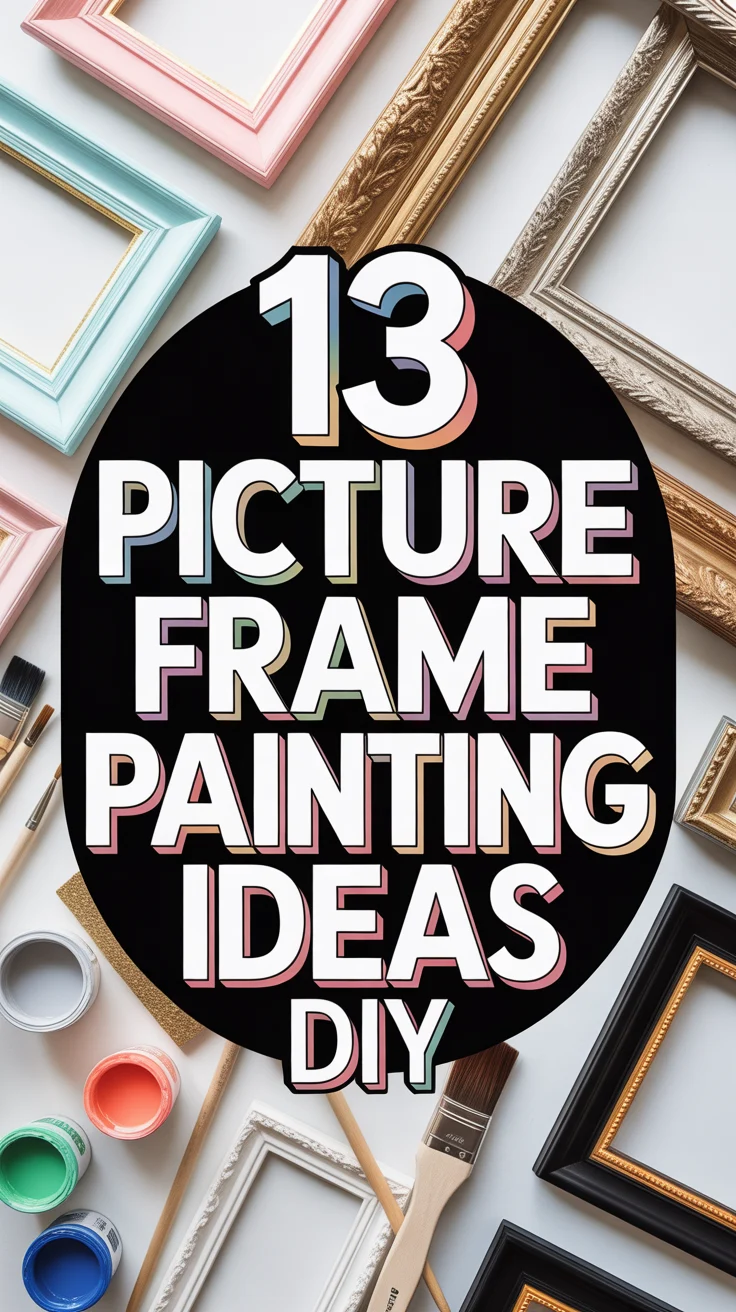
🖼️ 13 Picture Frame Painting Ideas DIY
🛠️ The Ultimate Maker's Toolkit
I've tested thousands of craft tools over the years. Whether you are quilting, crafting, or building mixed-media art, these are the top 5 absolute non-negotiable tools I personally recommend to guarantee professional results.
🪡 SINGER Heavy Duty 4452 Sewing Machine
The sewing community highly recommends this as the ultimate "bulletproof" entry-level machine. Its heavy metal frame powerfully pushes through thick denim and heavy quilt layers that would instantly jam a standard plastic machine.
✂️ Fiskars 8" Orange-Handled Scissors
Never settle for dull dollar-store blades. Wirecutter repeatedly names Fiskars the absolute best all-purpose craft scissor due to its legendary precision-ground blades and an ergonomic grip that prevents hand-cramping.
🔥 Gorilla Dual Temp Hot Glue Gun
Named Wirecutter's top choice because it literally does the work of two tools. It features dual-temperature settings offering low heat for delicate florals and blistering high heat for heavy wood adhesion repairs.
🖌️ Mod Podge Waterbase Gloss Sealer
The absolute undisputed champion of decoupage and paper crafts. Experts rely exclusively on this exact water-based formula because it glues, seals, and finishes beautifully without yellowing or flaking over time.
🎨 Apple Barrel Acrylic Paint (2 oz)
The quintessential, incredibly inexpensive craft paint. Woodworkers and hobby painters swear by its smooth flow and matte finish, providing massive value and remarkably thick color coverage on rough surfaces.
Got a boring frame staring at you from the shelf like it’s judging your life choices? Let’s fix that with paint, personality, and zero fear. These quick DIYs turn any frame into a mini masterpiece. Brushes ready, chaos contained, vibes immaculate.
1. Color Dipped Corners
Bold corners make any frame look designer without trying too hard. Pick a neutral base and dip two corners in a contrasting pop color.
Use painter’s tape for crisp diagonals and go for high-gloss or satin for that boutique feel. Pro tip Lightly sand glossy frames so the paint sticks like it means it.
It works because the contrast draws the eye to the art, not just the frame.
2. Matte Chalk Finish
Chalk paint gives instant vintage without the flea market hunt. Soft hues like sage, dusty pink, or charcoal nail the cozy vibe.
Distress edges with fine-grit sandpaper for a subtle worn look. Pro tip Seal with clear wax to avoid scuffs and smudges.
The texture adds depth, making simple prints feel curated.
3. Metallic Gilded Edges
Shimmer we love, glitter fallout we do not. Gild just the inner and outer edges with gold, rose gold, or antique brass.
Use a thin liner brush for precision and keep a cotton swab handy for cleanup. Pro tip Layer over black for max drama.
It gives subtle luxe without overpowering the artwork.
4. Two-Tone Split Frame
Half-and-half color blocking is bold but clean. Pick one neutral and one bright, split horizontally or vertically.
Tape carefully and paint light color first, then the darker shade. Pro tip Repeat one of the colors inside your room for cohesion.
The balance reads modern and intentional, not chaotic.
5. Terrazzo Speckles
Faux terrazzo is playful and oddly sophisticated. Paint a solid base, then flick or dab speckles in 3–4 colors.
Use a stiff brush or old toothbrush to spatter evenly. Pro tip Keep specks small for a chic look, larger for funky vibe.
It adds pattern without stealing the spotlight.
6. Minimal Line Art
Fine lines, huge payoff. On a solid background, paint skinny geometric lines or arches.
A paint pen or liner brush keeps lines crisp; plan with light pencil first. Pro tip Metallic pens look amazing over deep navy or forest green.
The linear detail frames your art with quiet sophistication.
7. Ombre Gradient Wash
Soft fades = instant calm. Blend two shades from light to dark along the frame.
Work wet-on-wet with a soft brush and feather the middle. Pro tip Use analogous colors like teal to navy or blush to coral for seamless blending.
The gradient gently guides the eye inward.
8. Faux Woodgrain Magic
Upgrade a basic frame to rich “wood” with glaze techniques. Start with a mid-tone base, then drag a woodgrain tool through tinted glaze.
Practice on scrap first to get the knots right. Pro tip A touch of warm glaze over cool base adds depth.
It’s classic and pairs with basically everything.
9. Speckled Stone Effect
Stone-look paint screams museum gift shop in the best way. Use a speckle spray or sponge layers of gray, beige, and white.
Seal with matte topcoat to keep it realistic. Pro tip Add micro flecks of black for that granite vibe.
It’s neutral, textured, and quietly luxe.
10. Patterned Stencil Pop
Go graphic with a repeating stencil: herringbone, dots, or moroccan tile. Keep colors high-contrast.
Use minimal paint to avoid bleed; dab, don’t swipe. Pro tip Frame the pattern only on two sides for a cool asymmetry.
Pattern frames can elevate even simple black-and-white photos.
11. Brushstroke Expression
Loose painterly strokes look artsy without the art degree. Choose 2–3 complementary colors and layer visible strokes.
Keep strokes going in one direction for cohesion. Pro tip Add a few dry-brush passes for texture.
It feels spontaneous and makes the frame part of the story.
12. Chalkboard Message Frame
Functional and cute. Paint the frame with chalkboard paint and doodle mini captions or arrows around your photo.
Season the surface by rubbing chalk and wiping before first use. Pro tip Use liquid chalk markers for cleaner lines.
Interactive decor beats passive decor any day.
13. Neon Accent Stripe
One razor-thin neon stripe = instant energy. Go over a muted base and run a line along the inner edge.
Use washi tape as a guide for a perfect track. Pro tip Neon yellow or magenta plays well with grayscale art.
The tiny shock of color modernizes the whole piece.
- Supplies to keep handy painter’s tape, fine liner brush, foam brush, sandpaper, primer, topcoat.
- Best finishes matte for modern, satin for versatile, gloss for glam.
- Surface prep clean, sand lightly, prime if slick or dark.
✨ New Member Etsy Shops (100% Unsponsored!)
We are incredibly proud of the talent in this community! 💖 We've rounded up some gorgeous new Etsy shops launched by our very own members.
There are ZERO affiliate links in this post—just 100% pure support for our makers. Click below to shop small, show them some love, and find your new favorite items! 👇🛍️


Conclusion
Your frame doesn’t have to be background noise. A few smart paint moves turn it into a wingman for your art, your photos, your entire shelf situation.
Pick one technique, keep colors intentional, and seal the deal. Fast glow-up, tiny budget, big personality—your walls just got interesting.