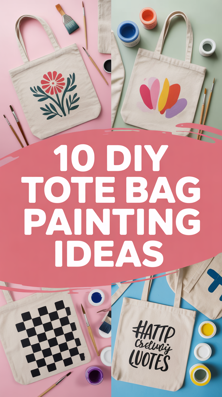
🖌️ 10 DIY Tote Bag Painting Ideas
Consider this your permission slip to turn a plain tote into a wearable art flex. No art degree needed, just paint, a brush, and a dash of chaos. We’ll keep it fun, low-stress, and very washable.

1. Minimalist Line Faces
Clean, chic, and deceptively easy. One continuous black line creates abstract faces that look gallery-ready. Pair with a neutral tote for major contrast.
Key points:
- Use fabric paint and a liner brush for crisp strokes.
- Sketch lightly with chalk first.
- Keep it asymmetrical to feel artsy, not math class.
Pro tip: Load your brush once and commit—hesitation makes wobbly lines.
Why it works: Negative space does the heavy lifting and looks effortlessly cool.
2. Bold Block Letters
Big letters, big personality. Spell your name, a city, or your coffee order because priorities.
Key points:
- Create paper stencils for clean edges.
- Use high-contrast colors like black on beige or neon on black.
- Seal with a heat set for durability.
Pro tip: Dab paint with a sponge, don’t brush—prevents bleeding.
Why it works: It’s graphic, readable, and looks designer with zero drama.
3. Retro Checkerboard
Channel skate-core energy with a checkerboard that screams cool but chill. Great for beginners and perfectionists alike.
Key points:
- Mask a grid with painter’s tape.
- Alternate two colors for a classic vibe or go multi-color for chaos.
- Work in layers for opaque squares.
Pro tip: Peel tape while paint is slightly wet to keep edges razor sharp.
Why it works: High contrast adds instant polish without overthinking.
4. Botanical Stamps
Natures meets lazy genius. Stamp leaves for organic shapes that look hand-crafted in the best way.
Key points:
- Use real leaves or foam stamps.
- Apply paint with a thin layer for crisp texture.
- Overlap prints for depth.
Pro tip: Add vein details with a fine brush after stamping.
Why it works: Imperfections make it charming and less copy-paste.
5. Gradient Sunset
Soft ombré that says “I have main character energy.” Works best with warm tones and a big brush.
Key points:
- Blend three to four colors from light to dark.
- Use a dry brush in horizontal strokes.
- Add a tiny silhouette like birds or a palm for flair.
Pro tip: Mist your brush lightly with water to smooth transitions.
Why it works: Gradients feel premium and hide tiny mistakes like a pro.
6. Doodle Collage
Turn your tote into your notebook margin. Stars, hearts, coffee cups—chaos, but curated.
Key points:
- Outline with fabric markers, fill with paint.
- Keep a limited palette so it doesn’t go kindergarten.
- Scale motifs up and down for rhythm.
Pro tip: Cluster doodles in corners and leave breathing room in the middle.
Why it works: It’s personal, playful, and endlessly customizable.
7. Painterly Florals
Loose, expressive petals that look like you spent hours—spoiler, you didn’t. Big strokes, big payoff.
Key points:
- Block shapes first, add highlights and centers last.
- Mix two shades per color for depth.
- Scatter leaves to frame the design.
Pro tip: Use the brush’s side for petal shapes—one swipe per petal.
Why it works: Romantic and forgiving; messy reads as intentional.
8. Monochrome Pattern Mash
Pick one color and go wild with patterns: stripes, dots, waves, repeat. Minimal effort, maximal vibe.
Key points:
- Stick to one hue for coherence.
- Vary line weight and spacing.
- Balance dense areas with empty space.
Pro tip: Use a paint pen for lines and a round brush for dots.
Why it works: Unified color keeps it chic even when the patterns party.
9. Abstract Shapes and Arches
Curvy blobs meet soft arches—aka the modern art starter pack. Add a tiny scribble for edge.
Key points:
- Sketch organic shapes lightly.
- Layer earthy tones or pastels.
- Let layers dry before overlapping.
Pro tip: Finish with a thin contrasting outline to snap it into focus.
Why it works: Balanced shapes feel calm but still interesting.
10. Repeat Typography Pattern
Pick a word and stamp it all over like you mean it. Think mantra, mood, or inside joke.
Key points:
- Create a custom stamp or use letter blocks.
- Stagger lines for a tiled effect.
- Alternate opacity for texture.
Pro tip: Anchor one bold word in the center, fade the rest around it.
Why it works: Repetition feels designer and reads from across the room.
Conclusion
Your tote is now a portable mood board, which is frankly iconic. Pick a style, grab fabric paint, and let the brush have its moment. The best part Time stamps fade, but a custom bag with personality stays winning.