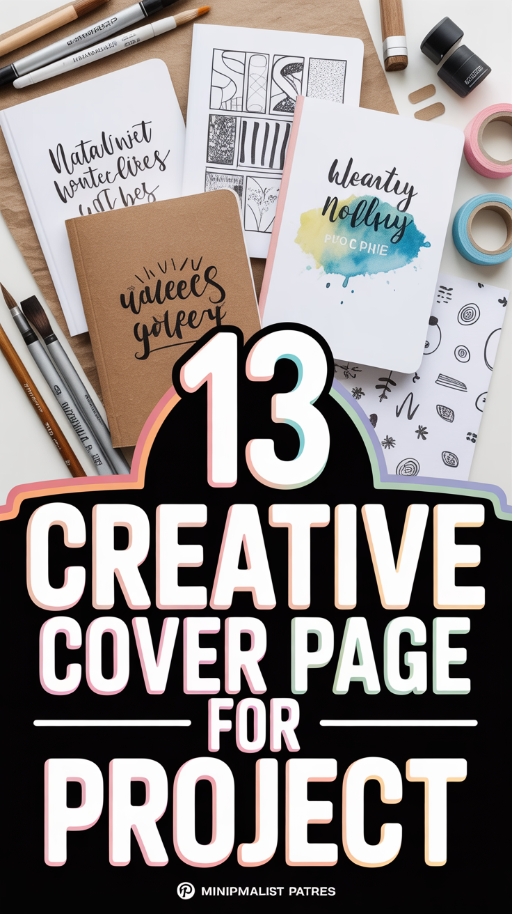
🎨 13 Creative Cover Page For Project
Let’s give your project cover the main character energy it deserves. No boring borders, no clip-art trauma. We’re talking bold, clever, and polished—in minutes, not a lifetime. Grab a coffee, we’re making your first impression do the heavy lifting.

1. Minimalist Monochrome Grid
Clean, modern, and quietly powerful. Use a single color with a crisp grid to organize title, subtitle, name, and date. Add subtle line weights for structure without clutter.
Pro tip: Pick one accent color and stick to it across the whole project for instant cohesion.
This works because it screams confidence and clarity without trying too hard.
2. Bold Typographic Stack
Let the fonts do the talking. Stack your title in large, contrasting type sizes and weights with tight spacing. Keep the rest minimal and aligned.
Pro tip: Pair a chunky sans-serif with a refined serif for that high-low vibe.
It works because strong typography looks intentional and professional faster than you can say kerning.
3. Geometric Shapes Overlay
Abstract shapes, layered like a visual mixtape. Use circles, triangles, and angled blocks behind your text to create depth and movement.
Pro tip: Use a 60-30-10 color ratio to balance bold with breathable.
It pops because geometry gives instant structure and visual rhythm.
4. Black and White With One Accent
High-contrast drama, minus the chaos. Keep everything black and white, then drop one eye-catching accent for headings or a stripe.
Pro tip: Red, teal, or neon lime make clean statements without overwhelming.
It works because it’s striking, readable, and timeless.
5. Photo Banner With Blur
Add a relevant photo banner at the top, blur it slightly, and overlay your title. Professional vibe, zero design degree needed.
Pro tip: Use a royalty-free image and keep the blur around 20–30% for legibility.
It works because it blends storytelling with clarity.
6. Hand-Drawn Doodles Edge
Playful but polished. Keep the center clean and add simple doodles around the edges—icons, arrows, tiny labels.
Pro tip: Stick to one line weight and one color for cohesion.
It wins because it feels human, creative, and memorable.
7. Color-Blocked Quadrants
Divide the page into four blocks with complementary shades. Put the main title across two blocks for drama.
Pro tip: Use muted tones for academic work, bold tones for creative projects.
This works because color blocking creates instant hierarchy and balance.
8. Minimal Icon System
Use three to five small icons to hint at your project theme. Keep text aligned left and give yourself generous margins.
Pro tip: Outline-style icons feel cleaner than filled ones at small sizes.
It works because icons add clarity and quick context.
9. Vertical Sidebar Title
Rotate your title along a colored sidebar. Place your name, course, and date aligned on the right for a sleek split layout.
Pro tip: Keep the sidebar under 25% width so it frames, not smothers.
It works because it feels editorial and fresh.
10. Gradient Wash Background
Soft gradient, big impact. Use a subtle top-left to bottom-right blend and set your text in high contrast.
Pro tip: Avoid rainbow explosions—two analogous colors are your friend.
It works because gradients add depth without clutter.
11. Data-Driven Accent
Feature one compelling stat or chart snippet as a visual anchor. Keep it small, crisp, and perfectly labeled.
Pro tip: Use a thin border box to separate it from the title area.
It works because it signals evidence and credibility from the jump.
12. Polaroid Frame Mockup
Drop an image inside a faux Polaroid frame with a handwritten-style caption. Align your title cleanly below.
Pro tip: Use subtle shadows only—no cheesy drop shadow tornadoes.
It works because it feels personal, visual, and story-first.
13. Blueprint Lines Theme
Thin grid lines, small annotations, and a blueprint-blue palette. Your title becomes the “project label.”
Pro tip: Add tiny measurement ticks as decorative dividers.
It works because it communicates precision and planning at a glance.
- Fonts: Limit to two—one for headings, one for body.
- Spacing: Generous margins make everything instantly chic.
- Hierarchy: Title big, subtitle medium, details small.
- Consistency: Mirror your cover style inside your project.
Conclusion
Your cover page sets the vibe before a single paragraph gets read. Pick a style, keep it consistent, and let it whisper I’m organized and mildly brilliant. With clear hierarchy, clean type, and one strong visual idea, you’ll look polished without breaking a sweat—or your sanity.