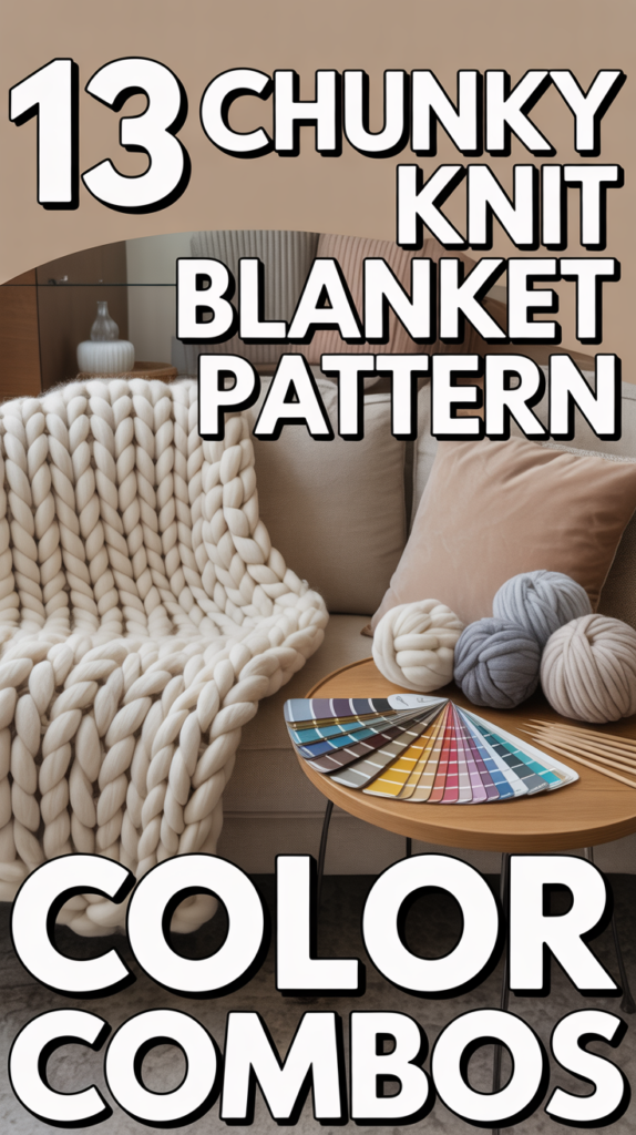
🧶 13 Chunky Knit Blanket Pattern Color Combos
Craving a blanket glow-up Faster than you can say purl, these color combos turn a simple chunky knit into couch candy. Zero fuss, maximum cozy. Let’s wrap your space in vibes.
1. Charcoal and Cream
Moody meets minimal. This combo nails that quiet luxury look without trying too hard. It’s cozy, but make it chic.
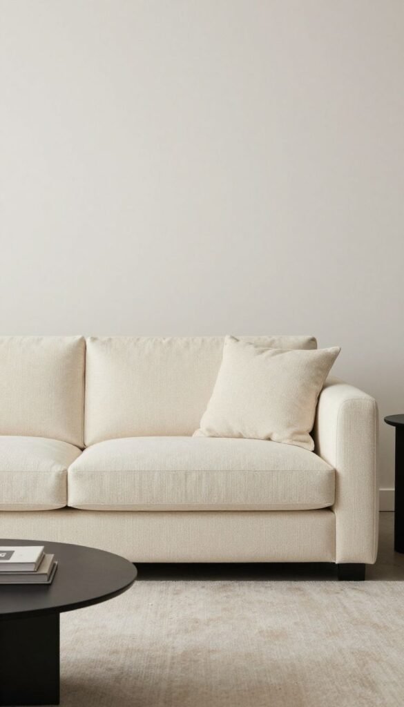
- Key points: High contrast, timeless, hides lint.
- Great for: Modern living rooms and monochrome lovers.
Pro tip: Use cream for the center panel and charcoal borders to frame the blanket like art.
Why it works It balances light and depth, so the texture gets all the attention.
2. Blush and Warm Taupe
Soft, romantic, and not overly sweet. Think latte foam meets rose petals. Your couch just blushed.
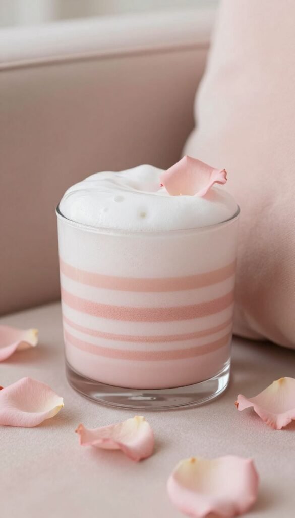
- Key points: Gentle warmth, spa-like energy, super soothing.
- Great for: Bedrooms and calm corners.
Pro tip: Stripe blush in thinner bands to keep it airy, not bubblegum.
Why it works The muted pair reads elevated, not precious.
3. Forest Green and Oat
Nature-core energy. Cozy cabin without chopping wood. Earthy tones that instantly ground a room.

- Key points: Organic feel, pairs well with wood, seasonless.
- Great for: Reading nooks and plant-filled spaces.
Pro tip: Use forest for the bulk, oat for chunky tassels for subtle contrast.
Why it works It adds depth without screaming for attention.
4. Navy and Mustard
Bold, vintage, slightly academic. Like a varsity sweater for your sofa. Statement without chaos.
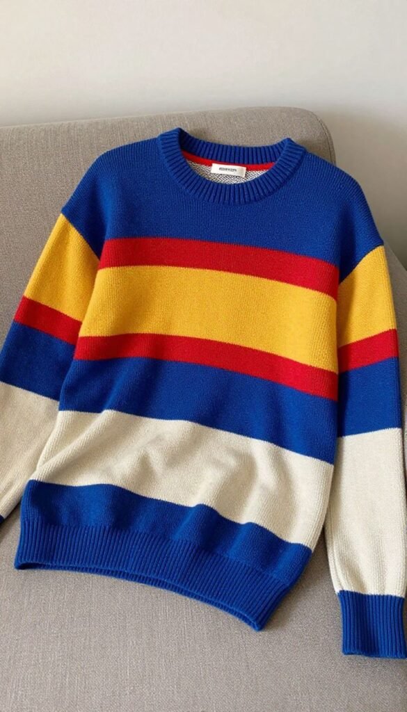
- Key points: High-impact, retro-cool, hides stains.
- Great for: Dens and TV rooms.
Pro tip: Try wide color blocks instead of stripes for graphic drama.
Why it works Complementary warmth cools down navy’s seriousness.
5. Dusty Blue and Clay
Calm sky meets sun-baked earth. It’s soft but not shy. Balanced and artsy.

- Key points: Muted, Instagram-friendly, soothing.
- Great for: Minimal or Scandinavian interiors.
Pro tip: Use clay as a thin checker pattern to break up the blue.
Why it works The undertones hug each other instead of competing.
6. Black and Camel
Classic coat energy in blanket form. Smart, sleek, forever cool. Your coffee table just got intimidated.
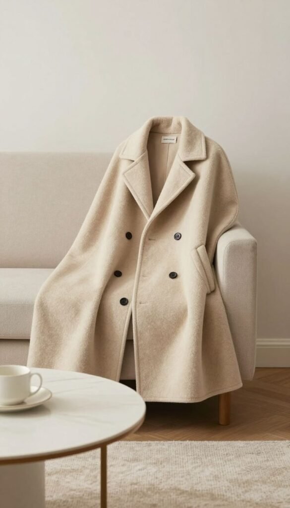
- Key points: Luxe vibe, versatile, ultra-polished.
- Great for: City apartments and modern spaces.
Pro tip: Keep stitch patterns simple to let the palette shine.
Why it works The neutral contrast gives sculptural texture real presence.
7. Sage and Ivory
Fresh, airy, gentle. Feels like opening a window. Spa day for your sofa.
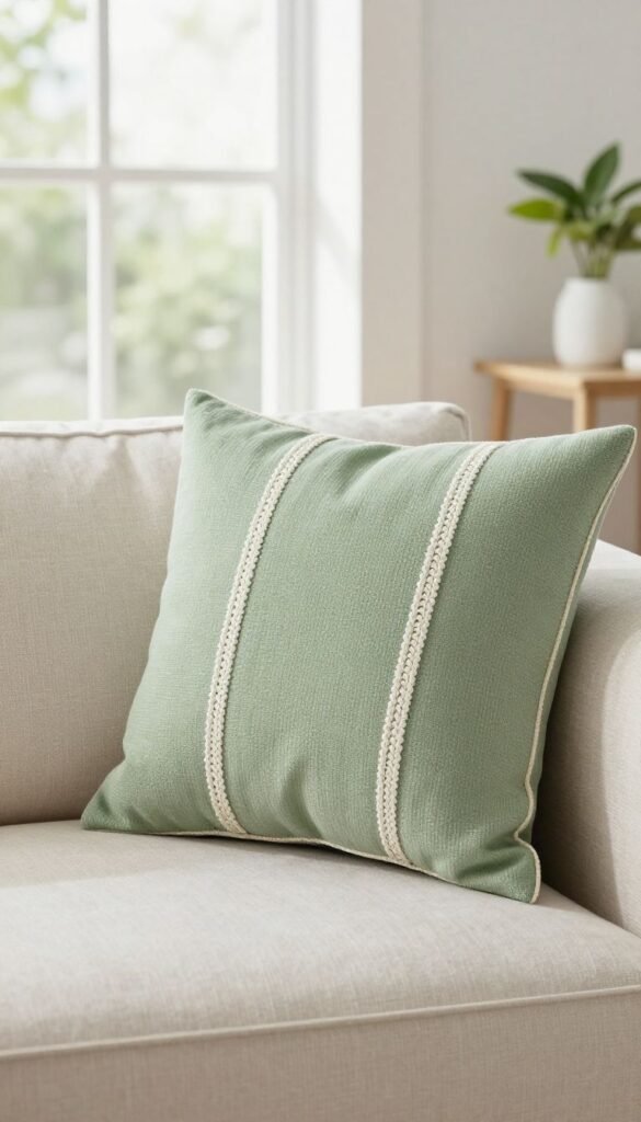
- Key points: Light, clean, calming greens.
- Great for: Spring refresh and guest rooms.
Pro tip: Use sage for wide panels and ivory for braided cables to highlight stitch work.
Why it works Soft contrast keeps the blanket breezy, not busy.
8. Terracotta and Charcoal
Warm meets edgy. Desert sunset with a city edge. Bold without shouting.
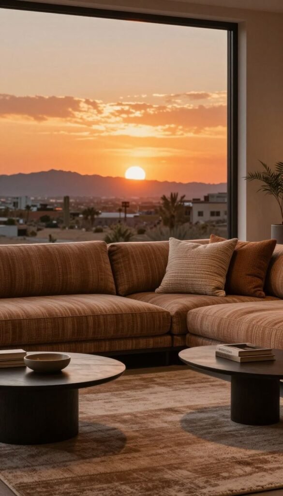
- Key points: Earthy richness, modern contrast, cozy aesthetic.
- Great for: Boho or industrial rooms.
Pro tip: Alternate two rows per color for a marled effect without actual marling.
Why it works The warmth of terracotta pops against the cool dark base.
9. Lavender and Grey
Soft but grown-up. Calming with a whisper of whimsy. Like a cloud that got a promotion.
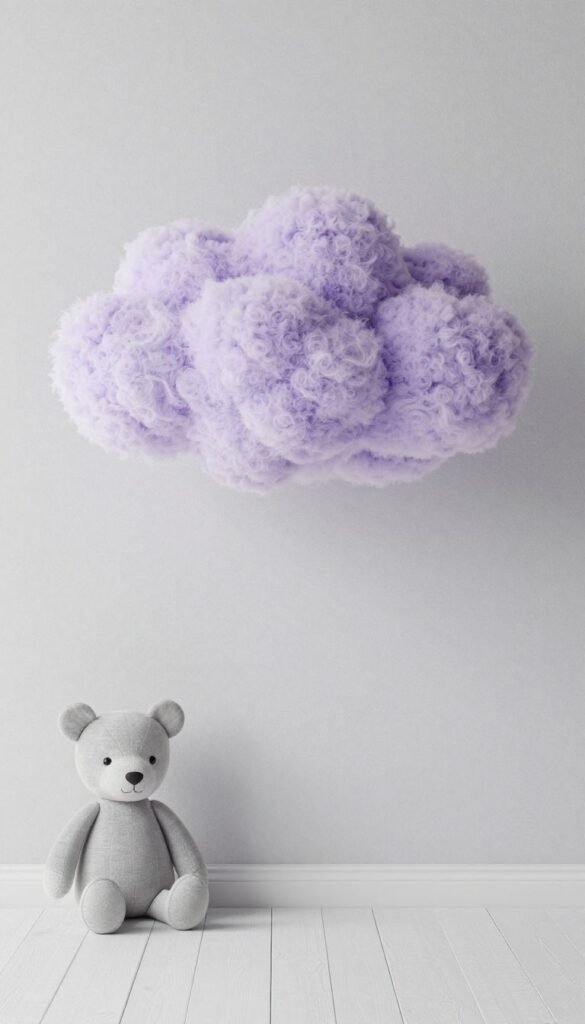
- Key points: Serene, subtle color play, gentle contrast.
- Great for: Nurseries or zen corners.
Pro tip: Use heathered grey to add depth to the pale lavender.
Why it works The grey grounds the pastel so it reads sophisticated.
10. Olive and Rust
Cozy autumn forever. Earthy, nostalgic, ridiculously photogenic. Cider optional, vibe mandatory.
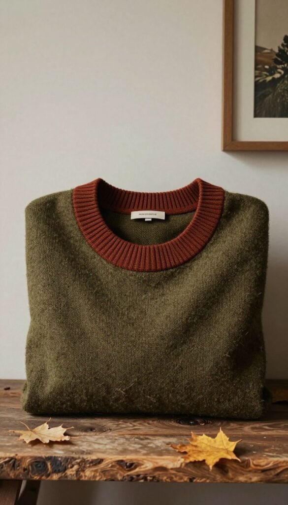
- Key points: Warmth, depth, vintage charm.
- Great for: Layering with leather and wood.
Pro tip: Use mossy olive as the base and rust for bold border ribs.
Why it works The tones harmonize like leaves in late afternoon light.
11. Ice Grey and Soft Pink
Frosty meets blush. Cool-toned but friendly. Clean, light, and fresh.
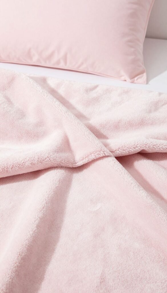
- Key points: Minimal, airy, modern feminine.
- Great for: Small spaces that need lift.
Pro tip: Keep pink in small geometric pops to avoid saccharine overload.
Why it works The cool grey tempers the sweetness for balance.
12. Teal and Sand
Coastal without the seashells. Relaxed, sunny, breezy. Beach day energy, no sunscreen needed.
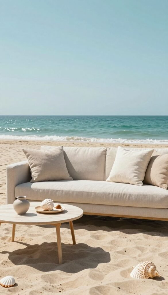
- Key points: Refreshing contrast, vacation vibe, versatile neutrals.
- Great for: Light-filled living rooms.
Pro tip: Use sand as wide stripes to soften teal’s intensity.
Why it works The neutral sand lets the teal glow without overwhelming.
13. Burgundy and Pearl
Rich and refined with a soft highlight. Cozy library chic. Glass of red optional.
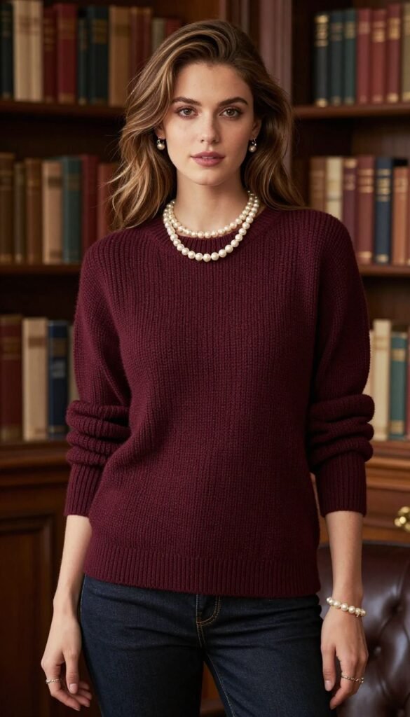
- Key points: Elegant, high-contrast, winter-ready.
- Great for: Holiday layering and luxe spaces.
Pro tip: Pearl cables over a burgundy field show off chunk and stitch definition.
Why it works Deep saturation plus light accents create dimension that feels opulent.
Conclusion
Color does the heavy lifting while your chunky stitches do the flirting. Mix smart hues, amplify texture, and boom—instant cozy statement. Pick a duo, cast on, and let your sofa flex a little.

