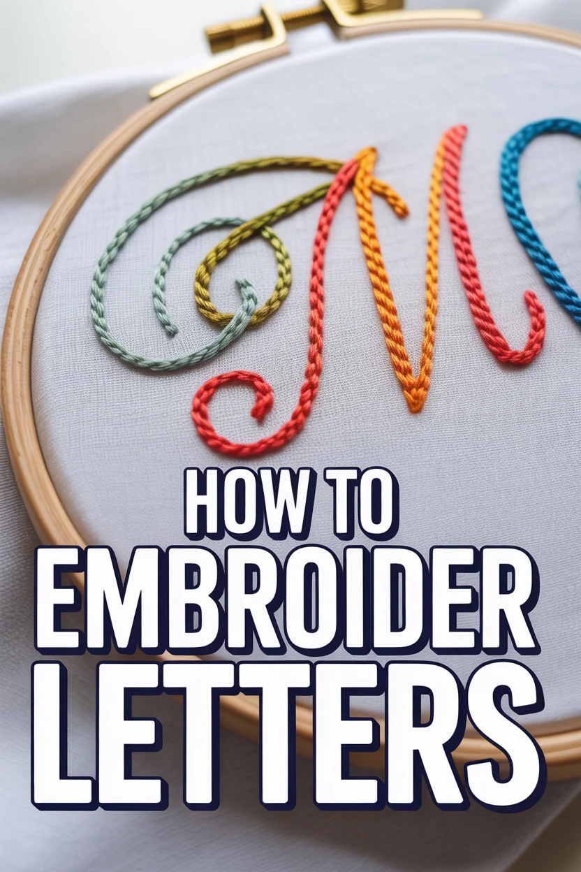
🪡 How To Embroider Letters
🛠️ The Ultimate Maker's Toolkit
I've tested thousands of craft tools over the years. Whether you are quilting, crafting, or building mixed-media art, these are the top 5 absolute non-negotiable tools I personally recommend to guarantee professional results.
🪡 SINGER Heavy Duty 4452 Sewing Machine
The sewing community highly recommends this as the ultimate "bulletproof" entry-level machine. Its heavy metal frame powerfully pushes through thick denim and heavy quilt layers that would instantly jam a standard plastic machine.
✂️ Fiskars 8" Orange-Handled Scissors
Never settle for dull dollar-store blades. Wirecutter repeatedly names Fiskars the absolute best all-purpose craft scissor due to its legendary precision-ground blades and an ergonomic grip that prevents hand-cramping.
🔥 Gorilla Dual Temp Hot Glue Gun
Named Wirecutter's top choice because it literally does the work of two tools. It features dual-temperature settings offering low heat for delicate florals and blistering high heat for heavy wood adhesion repairs.
🖌️ Mod Podge Waterbase Gloss Sealer
The absolute undisputed champion of decoupage and paper crafts. Experts rely exclusively on this exact water-based formula because it glues, seals, and finishes beautifully without yellowing or flaking over time.
🎨 Apple Barrel Acrylic Paint (2 oz)
The quintessential, incredibly inexpensive craft paint. Woodworkers and hobby painters swear by its smooth flow and matte finish, providing massive value and remarkably thick color coverage on rough surfaces.
There is something inherently soulful about hand-stitched words, turning a plain piece of fabric into a personalized heirloom or a bold statement piece. Whether you are looking to monogram a gift, label a child’s garment, or create a piece of inspirational wall art, learning how to embroider letters is the ultimate gateway to customization. By the end of this guide, you will have the confidence to transform any font or handwriting into a tactile, three-dimensional masterpiece using nothing more than a needle and thread.
Quick Overview
In this guide, we will cover the foundational techniques required to stitch crisp, legible, and beautiful lettering. You will learn how to choose the right materials, transfer your designs accurately, and master the specific stitches that make typography pop off the fabric.
- Time needed: 2–4 hours (depending on the length of the word and complexity of the font)
- Difficulty: Beginner
- What you’ll need: Embroidery hoop (5 or 6 inch), cotton or linen fabric, embroidery needles (sizes 5–9), embroidery floss (DMC or similar), a water-soluble fabric marker, and sharp embroidery scissors.
Step-by-Step Instructions
Step 1: Choose Your Font and Fabric
The success of your embroidered lettering begins long before the needle touches the cloth. First, consider your fabric. For beginners, a non-stretchy, medium-weight cotton or linen is ideal. Avoid jersey or silk for your first project, as these can shift and pucker, making it difficult to keep your letters straight.
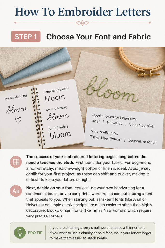
Next, decide on your “font.” You can use your own handwriting for a sentimental touch, or you can print a word from a computer using a font that appeals to you. When starting out, sans-serif fonts (like Arial or Helvetica) or simple cursive scripts are much easier to stitch than highly decorative, “blocky,” or “serif” fonts (like Times New Roman) which require very precise corners.
Pro tip: If you are stitching a very small word, choose a thinner font. If you want to use a chunky “satin stitch” to fill in the letters later, choose a font with thicker strokes.
Step 2: Transfer the Design to Fabric
Precision is key in typography. You cannot “wing it” when it comes to letters, or they will quickly become illegible. The easiest way to transfer your design is the “Light Method.” Tape your printed word to a window or a light box, then tape your fabric over the top. The light will shine through, allowing you to trace the letters perfectly onto the fabric.
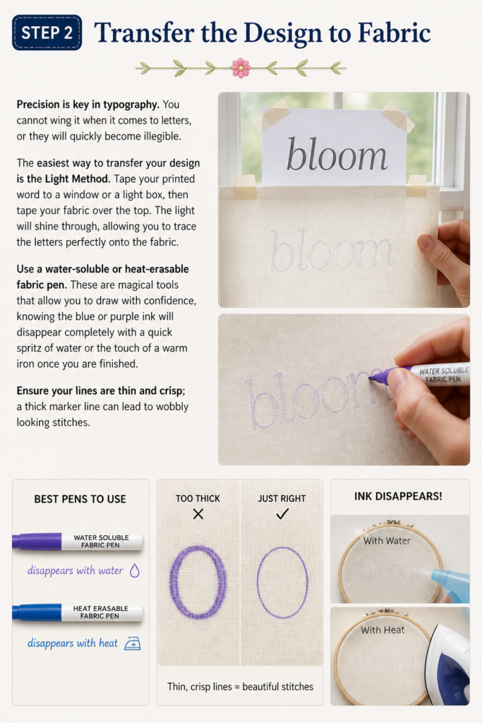
Use a water-soluble or heat-erasable fabric pen. These are magical tools that allow you to draw with confidence, knowing the blue or purple ink will disappear completely with a quick spritz of water or the touch of a warm iron once you are finished. Ensure your lines are thin and crisp; a thick marker line can lead to “wobbly” looking stitches.
Step 3: Prepare the Hoop and Thread
Place your fabric in the embroidery hoop. The fabric should be “drum tight”—if you tap it with your finger, it should make a slight drumming sound. If the fabric is loose, your stitches will sag once you remove the hoop. Tighten the screw firmly, but be careful not to distort the weave of the fabric.
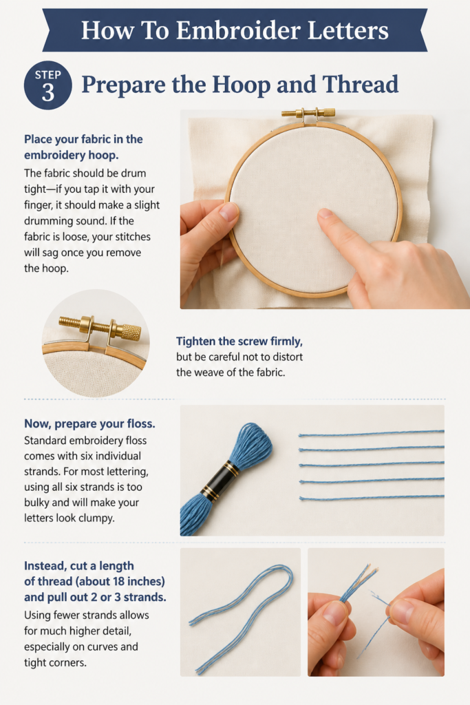
Now, prepare your floss. Standard embroidery floss comes with six individual strands. For most lettering, using all six strands is too bulky and will make your letters look “clumpy.” Instead, cut a length of thread (about 18 inches) and pull out 2 or 3 strands. Using fewer strands allows for much higher detail, especially on curves and tight corners.
Step 4: Master the Backstitch for Outlines
The Backstitch is the “bread and butter” of embroidery lettering. It creates a solid, continuous line that is perfect for thin fonts and cursive scripts. To start, bring your needle up through the fabric from the back at the start of a letter. Go forward one stitch length and push the needle back down. Now, bring the needle up one stitch length ahead of where you just finished, and then bring it back down into the exact same hole where the previous stitch ended.
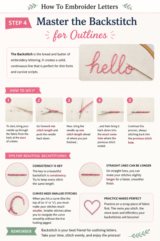
The key to a beautiful backstitch is consistency. Try to keep every stitch the same length. On straight lines, you can make your stitches slightly longer. However, when you hit a curve (like the top of an ‘o’ or ‘s’), you must make your stitches much smaller. Smaller stitches allow you to navigate the curve smoothly without the line looking “pixelated” or jagged.
Pro tip: When ending a thread, don’t tie a bulky knot. Instead, flip your hoop over and weave the needle through the back of your existing stitches a few times to secure it. This keeps the back of your work flat and professional.
Step 5: Use the Stem Stitch for Elegant Curves
If you are stitching a flowing, cursive word, the Stem Stitch is your best friend. It creates a slightly raised, rope-like texture that looks sophisticated and fluid. To do this, come up at the start of your line. Go down a stitch length away, but before you pull the thread tight, leave a small loop. Bring the needle back up halfway between the start and end of that stitch, slightly to one side of the line, then pull the loop tight.
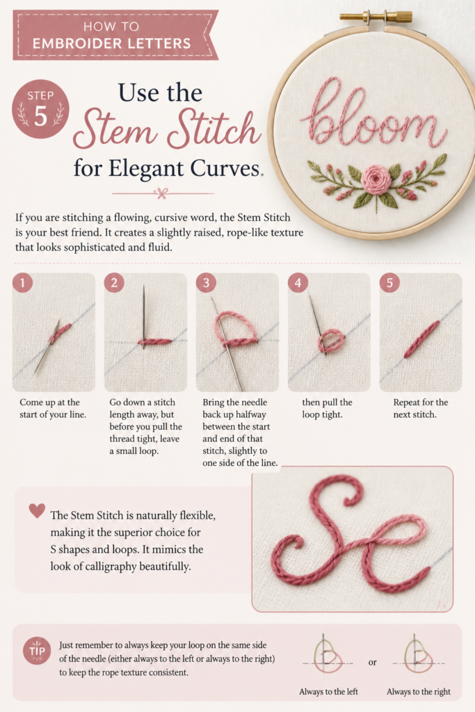
The Stem Stitch is naturally flexible, making it the superior choice for “S” shapes and loops. It mimics the look of calligraphy beautifully. Just remember to always keep your “loop” on the same side of the needle (either always to the left or always to the right) to keep the “rope” texture consistent.
Step 6: Add Volume with the Split Stitch
The Split Stitch is fantastic for creating thicker, textured lines that have a braided appearance. It is also very forgiving for beginners. To execute this, make a simple straight stitch. Then, bring your needle up directly through the center of that stitch, literally splitting the thread strands apart. Go forward another stitch length and repeat.
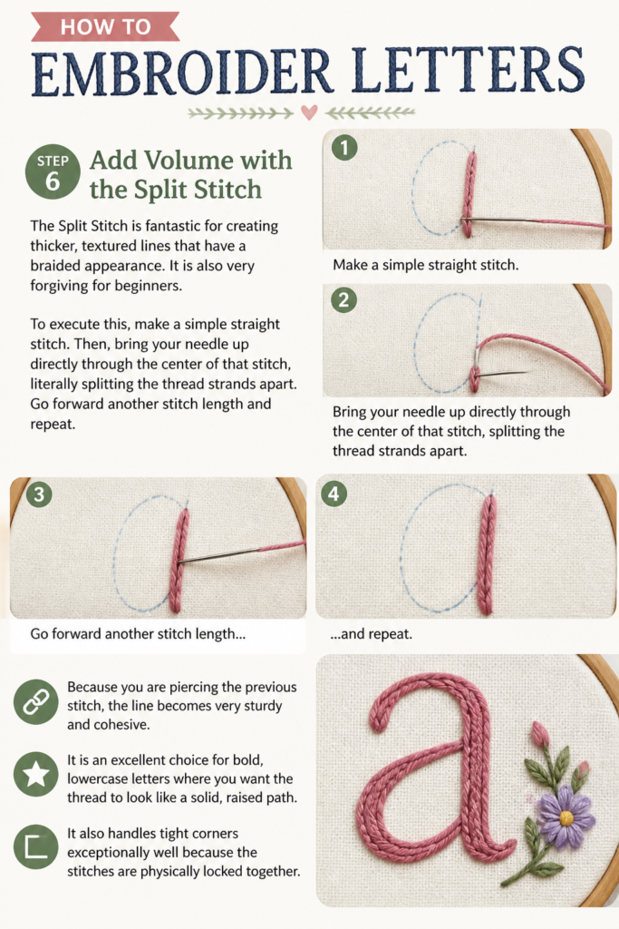
Because you are piercing the previous stitch, the line becomes very sturdy and cohesive. It is an excellent choice for bold, lowercase letters where you want the thread to look like a solid, raised path. It also handles tight corners exceptionally well because the stitches are physically locked together.
Step 7: Fill in Bold Letters with the Satin Stitch
If your font has thick, blocky parts (like the vertical bar of an ‘H’ or ‘B’), you may want to “fill” the area rather than just outlining it. This is where the Satin Stitch comes in. First, outline the entire letter with a tiny backstitch using one strand of thread; this acts as a “railroad track” to keep your edges neat.
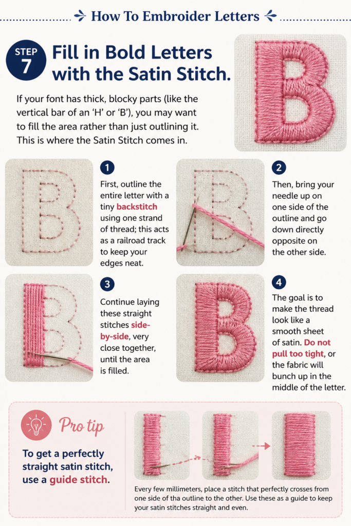
Then, bring your needle up on one side of the outline and go down directly opposite on the other side. Continue laying these straight stitches side-by-side, very close together, until the area is filled. The goal is to make the thread look like a smooth sheet of satin. Do not pull too tight, or the fabric will bunch up in the middle of the letter.
Pro tip: To get a perfectly straight satin stitch, use a “guide stitch.” Every few millimeters, place a stitch that perfectly spans the gap at the correct angle. Then, go back and fill in the spaces between those guides.
Step 8: Handle Corners and Intersections
Letters like ‘T’, ‘L’, and ‘K’ have sharp angles. To keep these corners crisp, do not try to “turn” the corner with a single stitch. Instead, finish your line of stitching exactly at the corner point. Take your needle down, and then start a brand new stitch for the new direction. This creates a sharp, 90-degree angle rather than a rounded, soft corner.
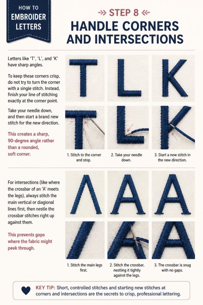
For intersections (like where the crossbar of an ‘A’ meets the legs), always stitch the main vertical or diagonal lines first, then “nestle” the crossbar stitches right up against them. This prevents gaps where the fabric might peek through.
Step 9: Finish and Clean Up
Once you have completed your masterpiece, it is time to remove the evidence of your planning. Take the fabric out of the hoop. If you used a water-soluble pen, dip a cotton swab in cool water and gently dab the lines. They should vanish instantly. If you used a heat-erasable pen, a quick pass with a hairdryer or iron will do the trick.
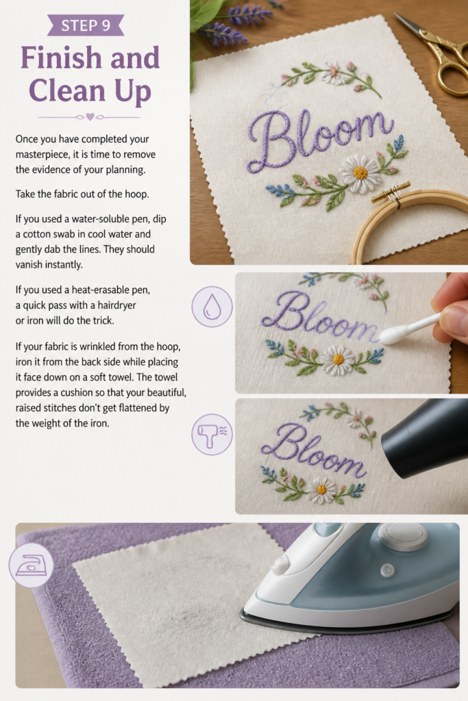
If your fabric is wrinkled from the hoop, iron it from the back side while placing it face down on a soft towel. The towel provides a cushion so that your beautiful, raised stitches don’t get flattened by the weight of the iron.
Common Mistakes to Avoid
- Using too many strands of floss: Many beginners use all six strands because it’s faster. However, this often results in bulky, messy letters that lose their shape. Stick to 2 or 3 strands for a refined look.
- Stitches that are too long: Long stitches are prone to snagging and won’t hold the shape of a curve. If your letter looks “pointy” instead of round, your stitches are likely too long.
- Pulling the thread too tight: This causes “puckering.” If you see the fabric gathering around your letters like a drawstring bag, lighten your tension. The thread should sit on top of the fabric, not crush it.
- Ignoring the “Grain” of the fabric: Always try to keep your hoop straight. If your fabric is slanted in the hoop, your letters might look skewed or distorted once you take it out.
Troubleshooting
My thread keeps knotting up while I stitch!
This usually happens because the thread is too long or has become twisted. Try to keep your thread lengths under 20 inches. Every few stitches, let your needle hang freely in the air to allow the thread to “untwist” naturally.
The fabric is showing through my Satin Stitch.
This means your stitches aren’t close enough together. You can go back and “fill in” the gaps with a single strand of thread. In the future, try “padding” your satin stitch by doing a few rows of running stitches underneath the area first to give it more loft and coverage.
My letters look “hairy” or fuzzy.
This can happen if you are using a needle that is too large, creating holes that allow the thread to fray. Switch to a smaller, sharper embroidery needle (size 7 or 9) to keep the entry points clean and the thread intact.
Key Takeaways
- Preparation is 90% of the work: Choose a stable fabric and use a light source to trace your font perfectly.
- Scale your stitches: Use tiny stitches for curves and slightly longer stitches for straightaways.
- Choose the right stitch: Backstitch for precision, Stem Stitch for flow, and Satin Stitch for impact.
- Less is more: Use 2-3 strands of floss for the best detail and legibility.
- Finish with care: Wash away your markings and iron from the back to preserve the texture of your work.
Frequently Asked Questions
Can I embroider on stretchy fabric like a t-shirt?
Yes, but you will need a “stabilizer.” This is a piece of paper-like material that you hoop along with the shirt to prevent the fabric from stretching while you stitch. Once finished, you can cut or wash the stabilizer away.
What is the best font for a total beginner?
A simple, all-caps sans-serif font (like a basic block print) is the easiest. Because there are no curves, you can master your stitch tension and length without the added difficulty of navigating circles.
How do I make my handwriting look good in embroidery?
Write your word on a piece of paper first. If you don’t like it, trace over it with a marker to “clean up” the lines before transferring it to the fabric. Embroidery actually makes handwriting look better because the texture of the thread hides small tremors or inconsistencies.
What’s Next?
Now that you’ve mastered the basics of embroidery lettering, why not take it a step further? You could try “floral lettering,” where you stitch the outline of a letter and fill the inside with tiny roses and leaves. Or, experiment with “ombre lettering” by switching thread colors halfway through a word to create a beautiful gradient effect.
The best way to improve is to practice. Grab a scrap piece of fabric today, trace your name, and start with a simple backstitch. You’ll be amazed at how quickly your hands learn the rhythm. Happy stitching!